Mobile-Friendly Chiropractic Websites: Why They Matter in 2025
![]() by Gerek Allen ~ Last Updated: November 4th, 2025 ~ 5 Min Read
by Gerek Allen ~ Last Updated: November 4th, 2025 ~ 5 Min Read
![]() by Gerek Allen
by Gerek Allen
~ Last Updated: November 4th, 2025 ~
~ 5 Min Read ~
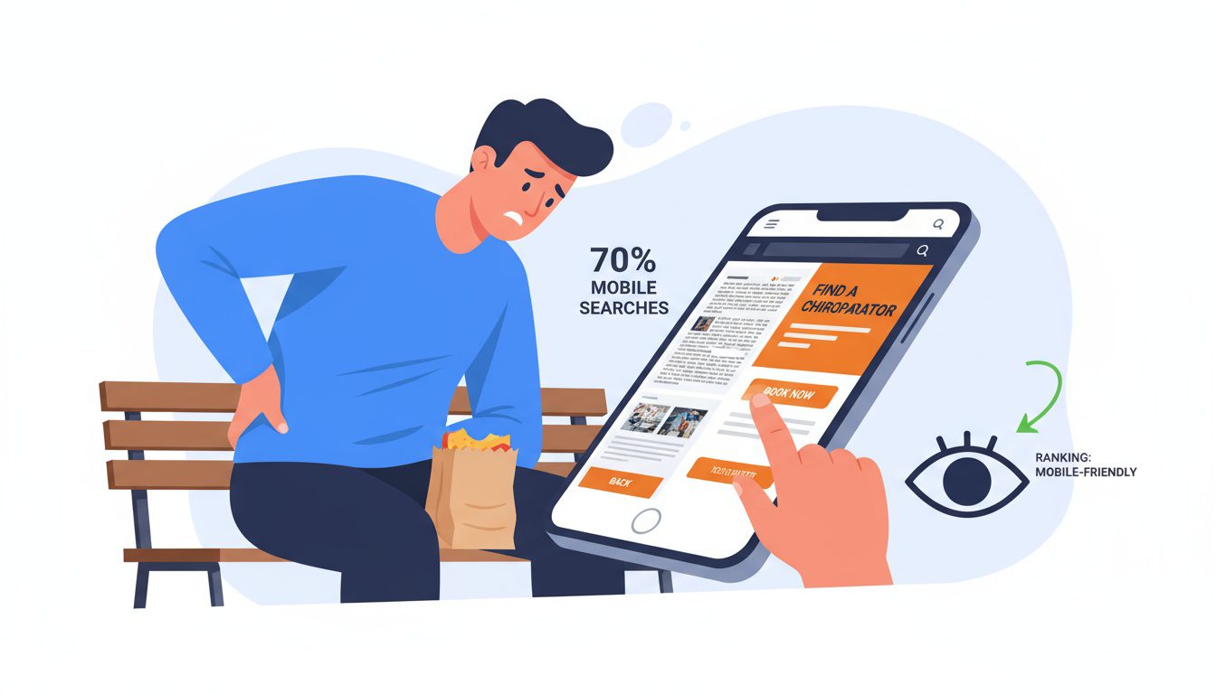
Over 70% of people search for chiropractors online, and many are doing it on their phones. If your website isn't mobile-friendly, you're invisible to the majority of potential patients.
Picture someone with acute back pain searching for help on their smartphone during their lunch break or commute. They find your practice in search results, click through, and encounter tiny text they can't read, buttons too small to tap, and images that don't fit their screen. Within seconds, they hit the back button and book with a competitor whose mobile site actually works.
In 2025, mobile-friendliness is the baseline expectation. Google prioritizes mobile-optimized sites in search rankings, which means a desktop-only website won't just frustrate users, it'll disappear from search results entirely.
Beyond rankings, mobile experience directly impacts conversions: sites that work seamlessly on phones convert visitors into appointments at dramatically higher rates.
In this guide, we'll explain why mobile optimization is critical for chiropractic practices in 2025, what elements make websites truly mobile-friendly, and how to ensure your site captures patients searching on smartphones and tablets.
Why Mobile-Friendly Matters for Chiropractors

Let's face it, we're all glued to our phones these days. According to a recent study, over 50% of web traffic comes from mobile devices. That's a lot of potential patients scrolling on their smartphones.
But here's the kicker: if your website isn't mobile-friendly, you're likely losing out on a ton of business. People have short attention spans online. If your site doesn't load quickly or look good on a phone, they'll bounce faster than you can say "spinal adjustment."
The Google Factor
Google's not just a search engine anymore. It's the gatekeeper of the internet. And guess what? They care a lot about mobile-friendliness. So much so that they use it as a ranking factor for search results.
What does this mean for you? If your chiropractic website design isn't mobile-friendly, it might not show up when people search for chiropractors in your area. Yikes.
Key Features of a Mobile-Friendly Chiropractic Website
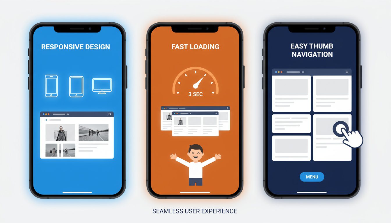
So what makes a website mobile-friendly? Let's break it down:
Responsive Design
This is the big one. A responsive design means your website adjusts to fit any screen size. Whether someone's viewing it on a tiny iPhone or a massive desktop monitor, everything should look great and work smoothly.
Fast Loading Times
Nobody likes waiting around for a slow website to load. This is even more true on mobile devices. Your site should load in 3 seconds or less, or you risk losing impatient visitors.
Easy Navigation
On a small screen, it's crucial that people can find what they need quickly. Your menu should be easy to use with thumbs. Buttons should be big enough to tap without zooming in.
Benefits of a Mobile-Friendly Chiropractic Website

Now that we know what makes a site mobile-friendly, let's talk about why it matters for your practice.
Improved User Experience
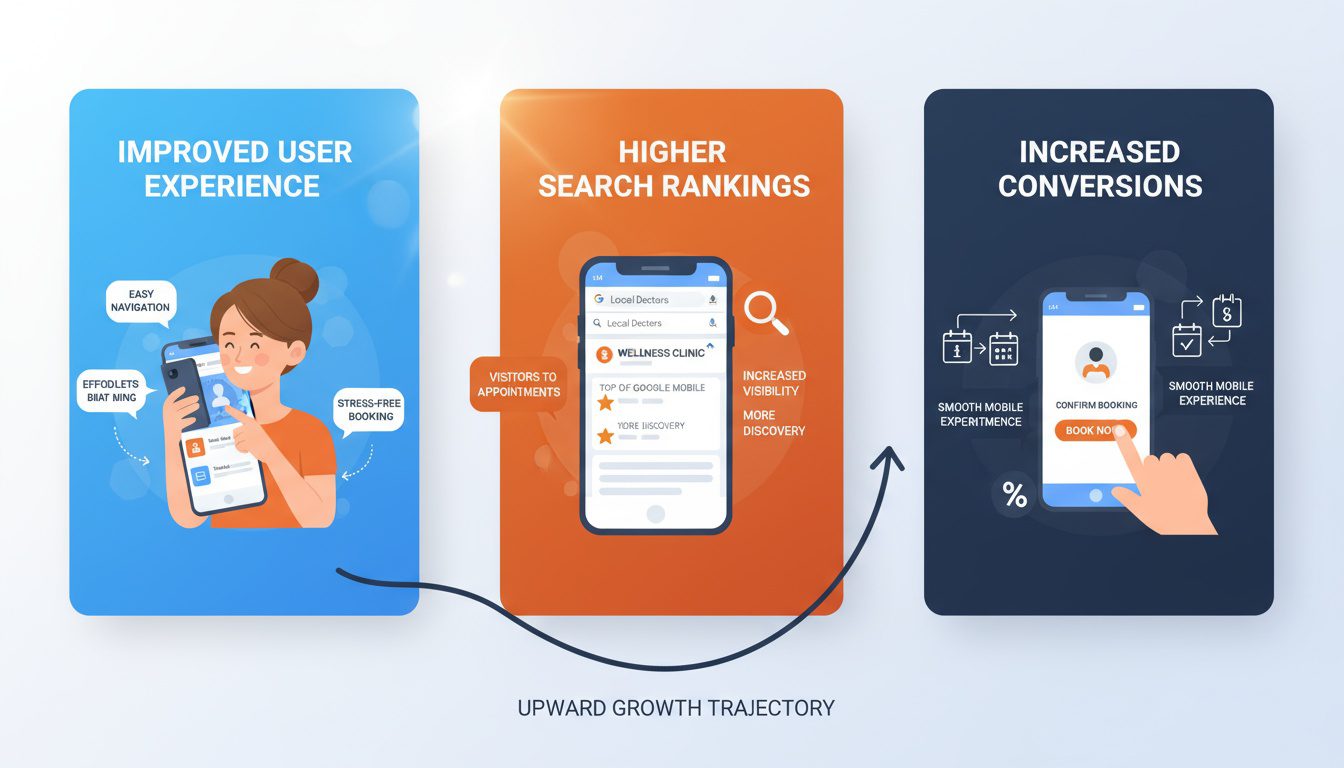
A mobile-friendly site is just plain easier to use. When potential patients can easily navigate your site and find the info they need, they're more likely to book an appointment.
Higher Search Engine Rankings
Remember what we said about Google? A mobile-friendly site can help you show up higher in search results. This means more visibility for your practice.
Increased Conversion Rates
When your pages work well on mobile, more website visitors turn into patients. It's that simple. A smooth mobile experience makes it easy for people to contact you or book appointments right from their phones.
Common Mistakes to Avoid
Creating a mobile-friendly site isn't just about what you should do. It's also about what you shouldn't do. Here are some common pitfalls to avoid:
Tiny Text
No one wants to squint at their phone screen. Make sure your text is large enough for reading comfortably on a small screen.
Oversized Images
Large images can slow down your site and eat up mobile data. Optimize your images for web use to keep things speedy.
Pop-ups
Pop-ups can be annoying on desktop, but they're downright frustrating on mobile. If you must use them, make sure they're easy to close on a touchscreen.
How to Check if Your Site is Mobile-Friendly

Not sure if your current site makes the grade? There are a few easy ways to check:
Google's PageSpeed Insights
Google no longer offers a standalone mobile-friendly test tool. Instead, its functionalities have been integrated into PageSpeed Insights, which provides a mobile-friendly report along with performance metrics, screenshots, and recommendations for improving your site's mobile experience.
To use this free tool, simply visit the PageSpeed Insights website and enter the URL of the page you want to test to get a comprehensive analysis.
Responsive Design Checker
This online tool lets you see how your site looks on different screen sizes. It's a great way to spot any layout issues.
Real Device Testing
The best test? Try it yourself. Pull up your site on your own phone and tablet. If it's hard to use, your patients will struggle too.
Steps to Make Your Chiropractic Website Mobile-Friendly

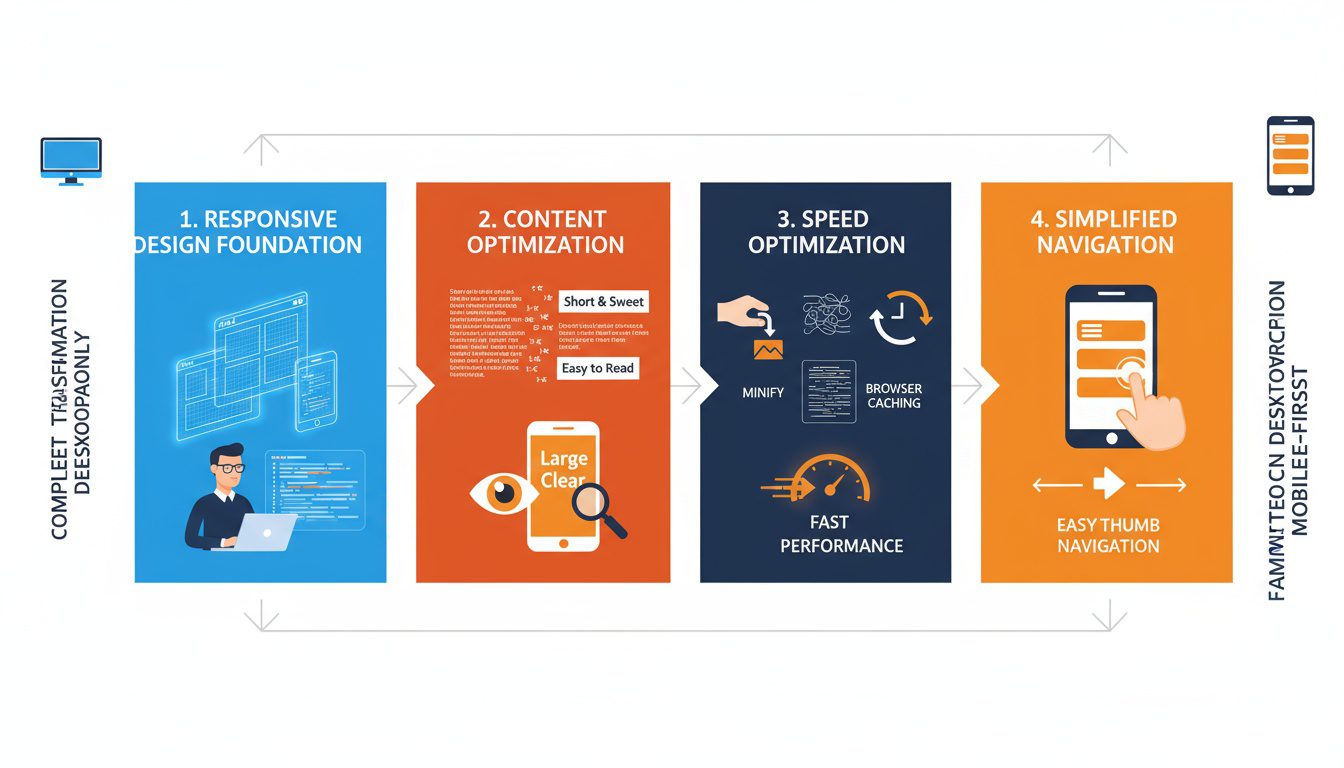
Ready to make your online chiro site mobile-friendly? Here's a quick action plan:
Implement Responsive Design
This is the foundation of a mobile-friendly site. If you're not a web developer, you might want to hire one to help with this step.
Optimize Your Content
Review your site's content. Is it easy to read on a small screen? Break up long paragraphs and use headers to make scanning easier.
Speed Up Your Site
Compress images, minify code, and leverage browser caching to make your site load faster on mobile devices.
Simplify Navigation
Make your menu easy to use on touchscreens. Consider a hamburger menu for mobile views.
Ready to See How We Fix Chiropractic Websites?
We've transformed 150+ service-based websites using our proven 4-step system. See exactly how we combine premium design with conversion science.
The Future of Mobile-Friendly Chiropractic Websites
As we look ahead to 2025 and beyond, mobile-friendliness will only become more important. Here are some trends to watch:
Voice Search Optimization
More people are using voice assistants to search. Make sure your site is optimized for natural language queries.
Progressive Web Apps
These blend the best of websites and mobile apps. They could offer a smoother, app-like experience for your patients.
AMP (Accelerated Mobile Pages)
This Google-backed project aims to make mobile pages load even faster. It could become a standard for mobile-friendly sites.
Frequently Asked Questions About Chiropractic Mobile-Friendly Website
How do I know if my chiropractic website is actually mobile-friendly?
Use Google's Mobile-Friendly Test tool (search.google.com/test/mobile-friendly) to get an instant assessment. Additionally, visit your site on various smartphones and tablets to test real-world usability. Check if text is readable without zooming, buttons are easy to tap with a thumb, forms work properly, and pages load quickly. Look for horizontal scrolling, overlapping elements, or content that extends beyond the screen—these indicate mobile issues. Ask patients or staff to test booking appointments on their phones and report any frustrations.
What are the most critical mobile-friendly features for chiropractic websites?
Click-to-call phone buttons prominently displayed at the top of every page, large tap-friendly "Book Appointment" buttons, simplified navigation menus that work with one hand, fast-loading pages (under 3 seconds), easy-to-complete forms with mobile-optimized input fields, and readable text without zooming (minimum 16px font size). Your address should link directly to maps apps, and critical information like hours and services should be accessible within two taps from the homepage.
Is having a mobile-responsive website enough, or do I need a separate mobile app?
A mobile-responsive website that adapts to different screen sizes is sufficient for most chiropractic practices—you don't need a separate mobile app. Responsive design provides excellent user experience across all devices without requiring patients to download anything. Mobile apps make sense only for large practices with extensive features like detailed treatment tracking, exercise libraries, or loyalty programs. For typical practices, invest in excellent mobile web experience rather than app development.
My website was built years ago—do I need to rebuild it from scratch for mobile optimization?
Not necessarily. Many existing websites can be retrofitted with responsive design frameworks without complete rebuilds. However, very old sites built before mobile-first design became standard may need complete reconstruction. Have a web developer assess your current platform—if it's built on modern content management systems like WordPress, mobile optimization might be achievable through theme updates and adjustments. If your site is built on outdated technology or custom code from 2015 or earlier, a rebuild is often more cost-effective than trying to patch mobile functionality onto an obsolete foundation.
Conclusion
A chiropractic mobile-friendly website is a must-have in 2025. Your online presence is often the first impression potential patients have of your practice so make it count.
By focusing on responsive design, fast loading times, and easy navigation, you can create a mobile-friendly site that attracts patients and helps your practice grow.
Remember, in the world of chiropractic care, a pain-free experience should start from the very first tap on your website.
So, take a good look at your current site. Is it up to the mobile challenge? If not, now's the time to make some changes.
You can implement all this yourself... or you can actually see what's already broken on your site right now.
Most chiropractors assume their website's fine. Then we show them they're losing 15-20 patients a month to simple, fixable problems.
Our Free Website Conversion Analysis is a personalized Loom walkthrough of your 3 biggest conversion killers—delivered in 24 hours, no pitch attached.
You'll see:
- Exactly why visitors leave
- What's broken on mobile
- Missing trust elements
- What to fix first
Get your free analysis here — honest feedback, nothing to buy.
Because guessing what's wrong costs you patients every single day.

Gerek Allen
Co-Owner iTech Valet
Entrepreneur, patriot, CrossFit junkie, IPA enthusiast, loves to travel to tropical destinations, and knows way too many movie quotes.
About iTech Valet
iTech Valet specializes in web design and content marketing for online entrepreneurs who want to share their expertise.
Services Include:
- Web Design
- Graphic Design
- Sales Copy
- Funnel Building
- Authority Sites
- Membership Sites
- Course Creation
- Email Systems
- Content Marketing
- Competitive Analysis
- Tech Integrations
- Strategic Planning


