
Chiropractor Website Design Case Study: From Template to Lead Magnet
![]()
![]()
![]()
![]()
![]()
![]()
~ Last Updated: July 19, 2025 ~
~ 5 Min Read ~
Atlas Chiropractic went from template to premium. Here's exactly how we did it.
The Problem: A Great Doctor with a Terrible Website
Dr. Colin Hardy is amazing at what he does. His patients love him. His practice in Sheridan, Wyoming is thriving.
But his website? Not so much.
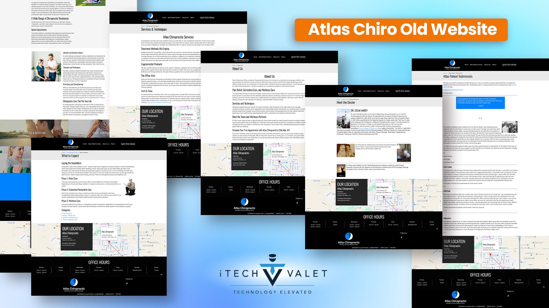

It looked like every other chiropractic website out there. Generic stock photos. Walls of boring text. Zero personality.
The real problem wasn't just how it looked. It was what it wasn't doing for his business.
Here's What Was Going Wrong
The old site was bleeding money. Every single day.
Think about it. People visit a website. They can't find what they need. They leave. They book with a competitor instead.
Dr. Hardy's website had some serious issues:
His site looked cheap. Like a $99 template from 2015. Not exactly screaming "premium healthcare," right?
There was no way to capture leads. The only time he got contact info was when someone actually booked. That's like trying to fill a bucket with a giant hole in the bottom.
The user experience was confusing. Visitors had to hunt for basic information. Where do I book? What does treatment cost? How long does it take?
No clear calls-to-action meant people didn't know what to do next. So they did nothing.
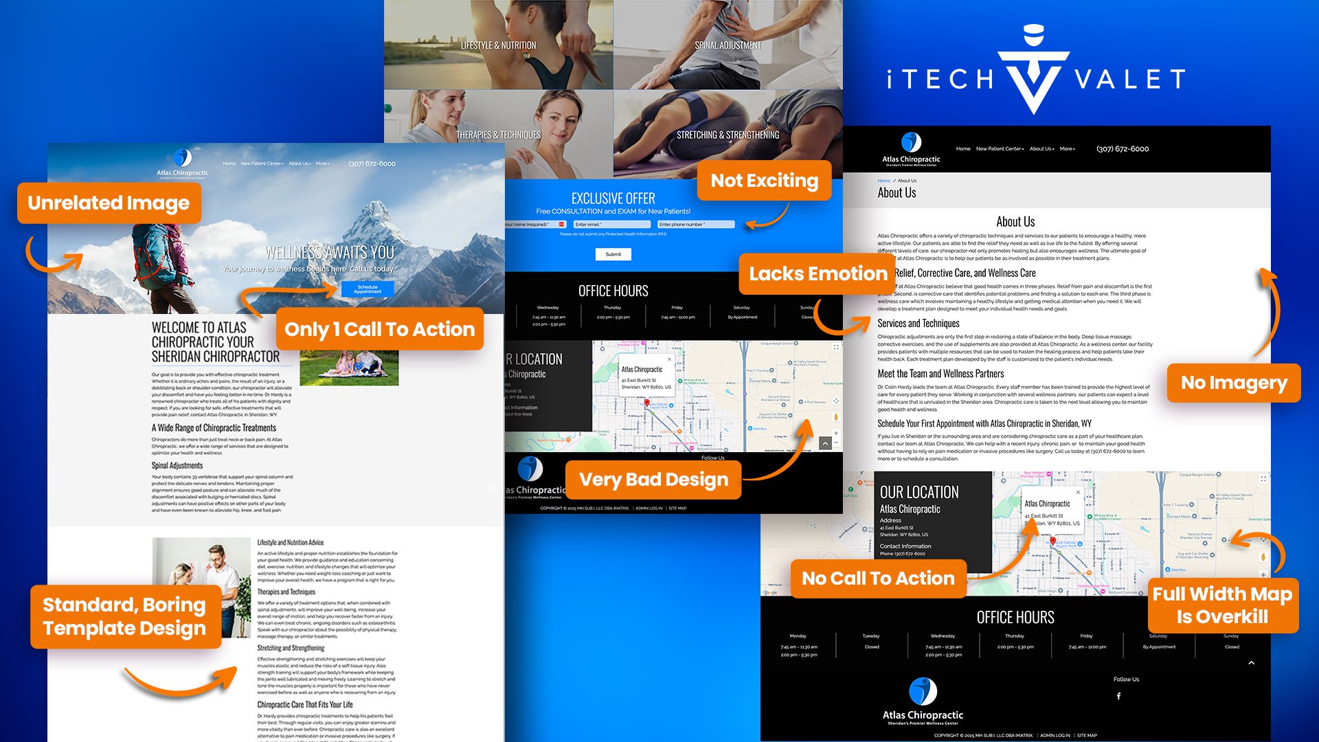

The testimonials were buried. Hidden at the bottom where nobody scrolls. They looked like spam emails.
And here's the killer: no email list building. Zero lead magnets. No way to stay in touch with people who weren't ready to book yet.
That's a lot of lost revenue walking out the door.
The Solution: Strategy Meets Beautiful Design
We didn't just make things "look prettier." We built a lead-generating system that works 24/7.
Here's exactly what we did.
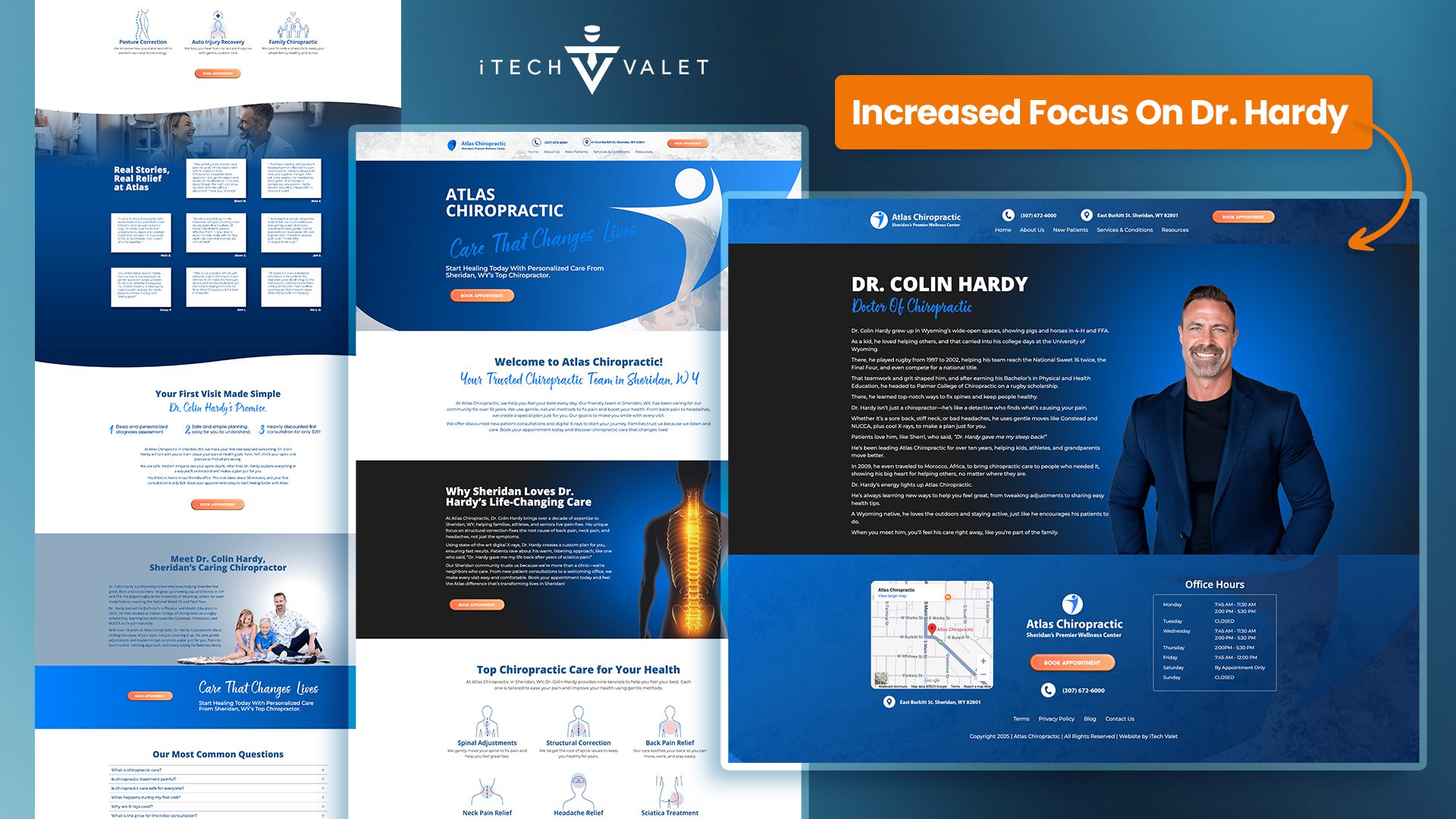
First: We Made the Practice and Dr. Hardy the Star

Second: We Created a Clear User Journey
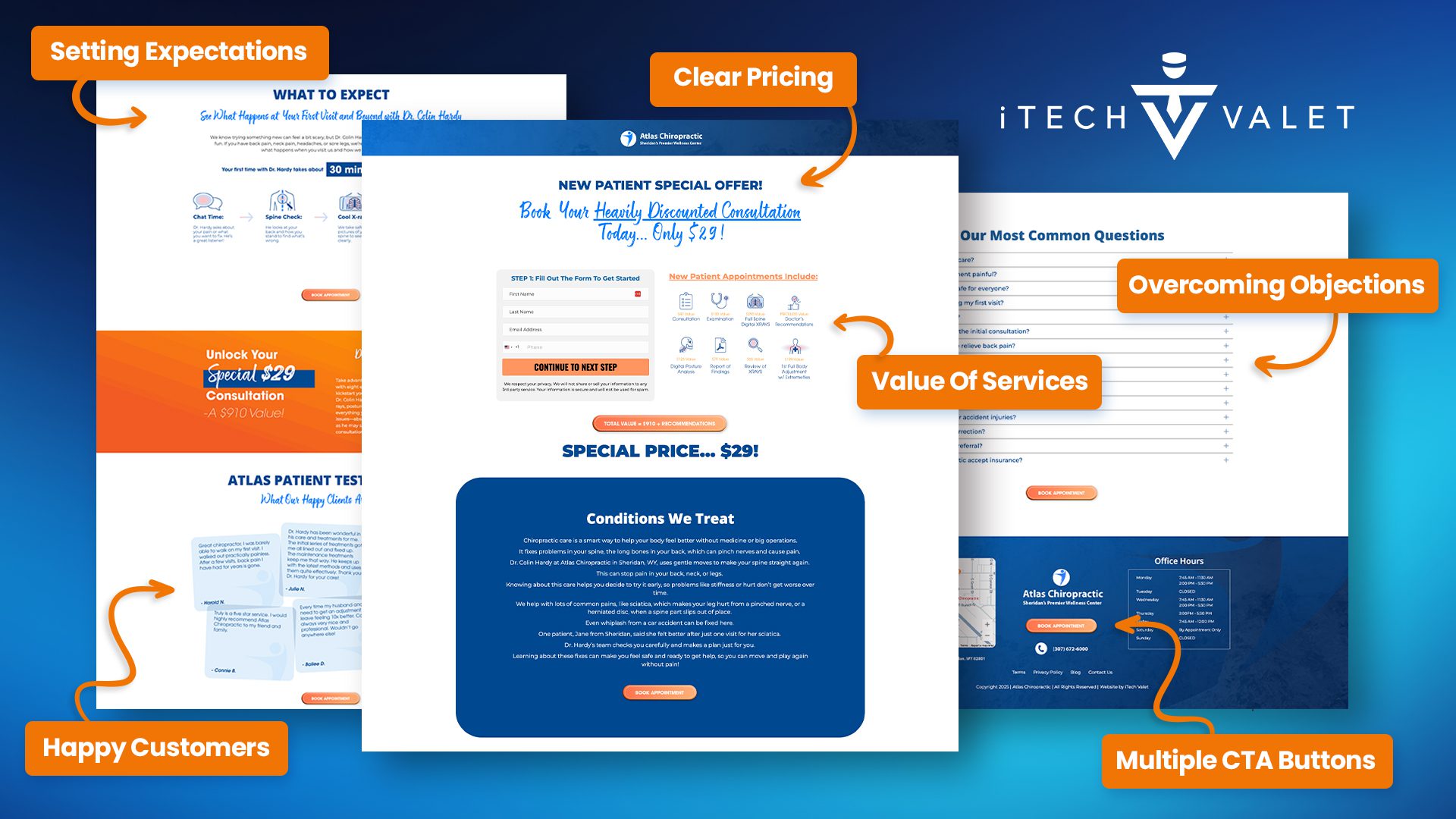

The old site was confusing. The new one guides visitors step-by-step toward booking.
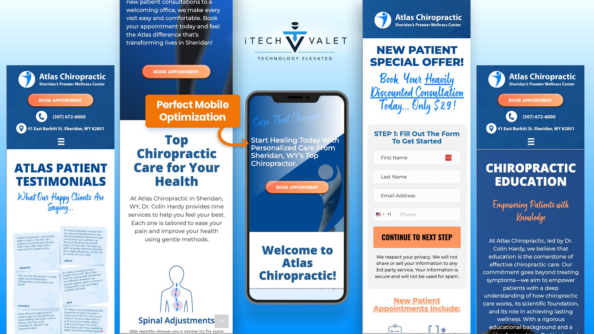
We added a special $29 consultation offer. Right up front. Hard to miss.
Why? Because people need a reason to choose you over the competition. A great deal gets them in the door.
Every section now has a purpose. It moves prospects closer to becoming patients.
Third: We Built Trust Through Better Testimonials
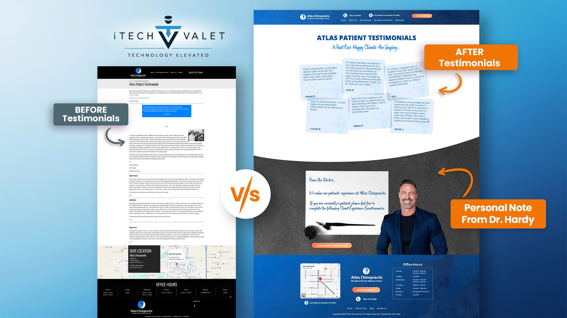

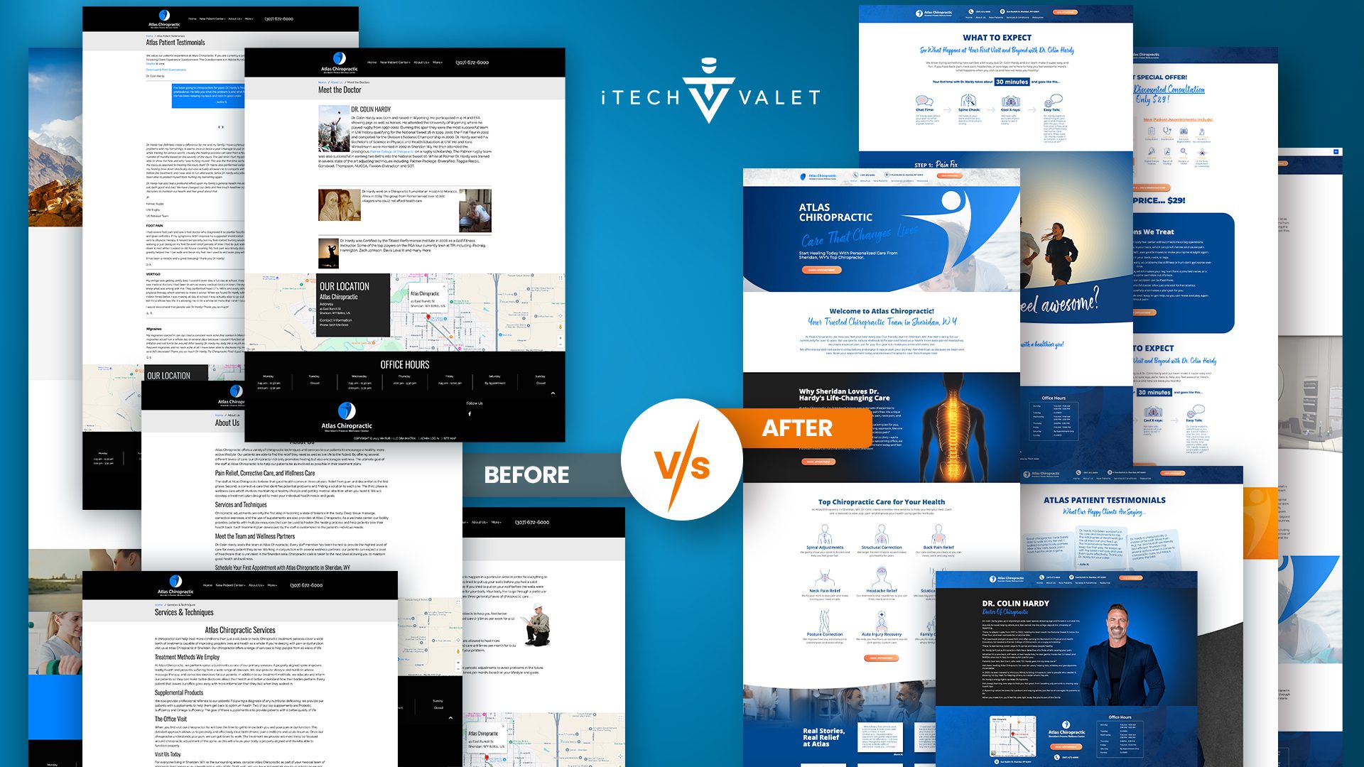
Before: Testimonials looked fake. Poor formatting. Buried at the bottom on the home page.
After: Beautiful design. Easy to read. Strategically placed where people actually see them.
Only used first names and last initial for privacy. They feel authentic... because they are.
Social proof now actually converts visitors instead of being ignored.
Page-by-Page Breakdown
The About Page Transformation
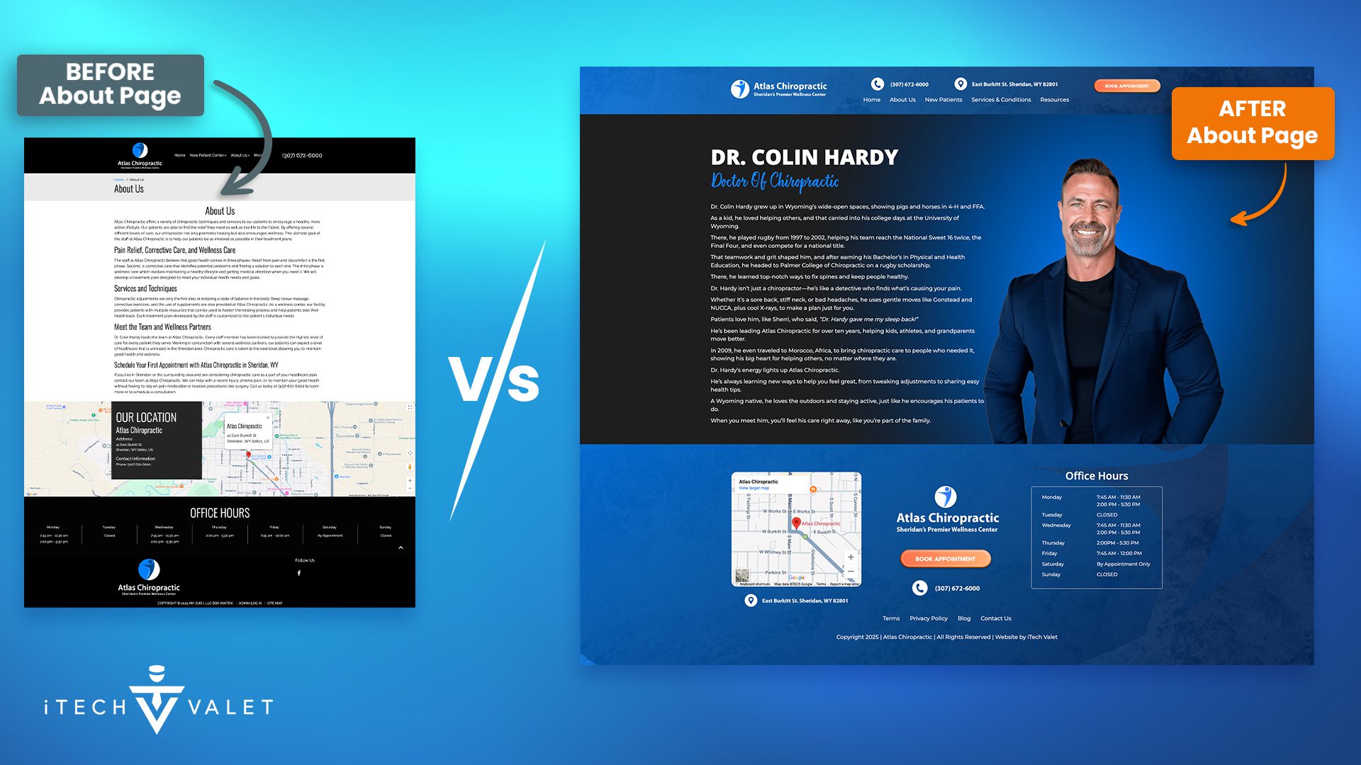

Dr. Hardy's old bio read like a boring resume. Dry facts. No personality. Zero connection.
The new version tells his story. Growing up in Wyoming. Playing rugby. His mission trip to Morocco.
People don't just want credentials. They want to know who you are as a person.
We kept the important stuff (education, certifications). But we made it human.
Services That Actually Sell
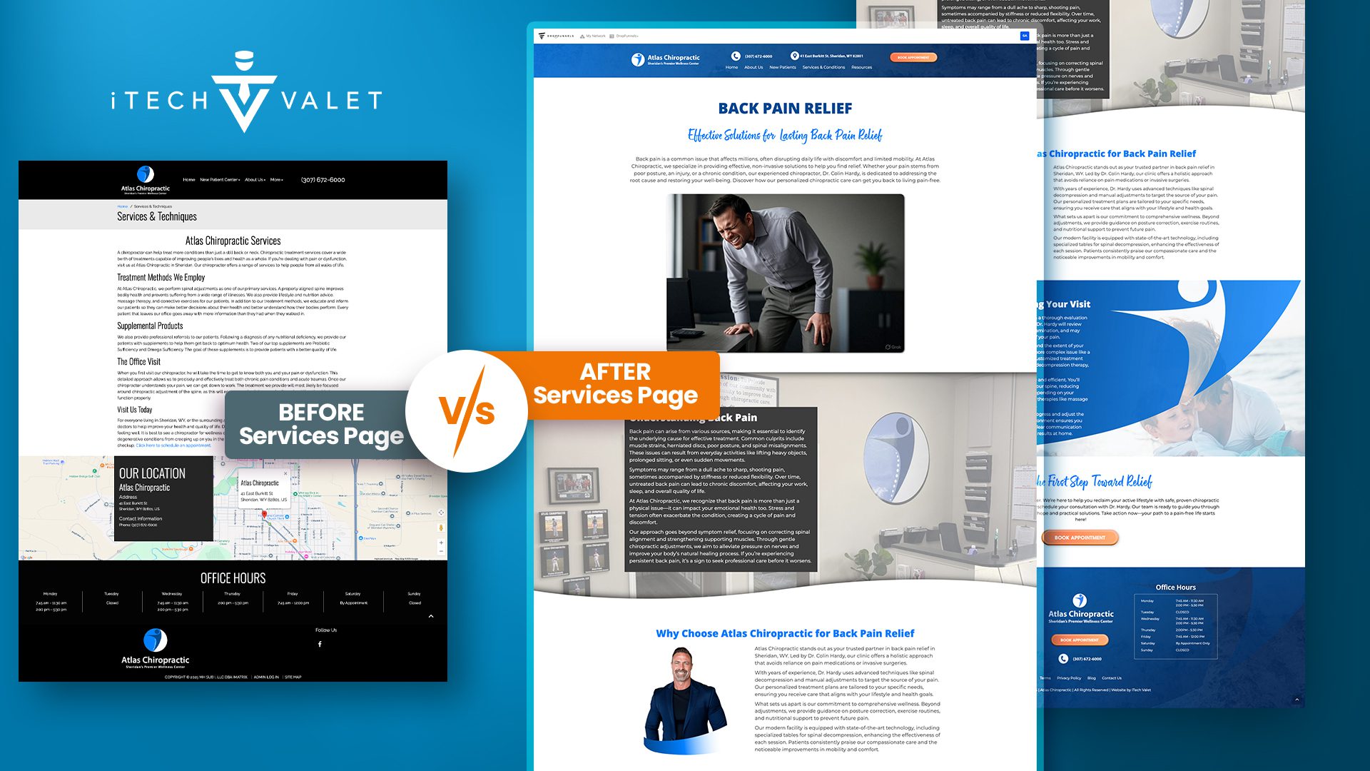

The old services page was generic. Could have been copied from any chiropractic website.
We created a "What to Expect" page instead. Much more helpful.
It walks prospects through exactly what happens. Chat time. Spine check. Cool X-rays. Easy talk.
We broke the treatment process into three simple steps:
- Pain Fix (get you feeling better fast)
- Make It Strong (keep the pain away)
- Stay Happy (long-term wellness)
Simple. Clear. Easy to understand.
Expectations That Are Clear
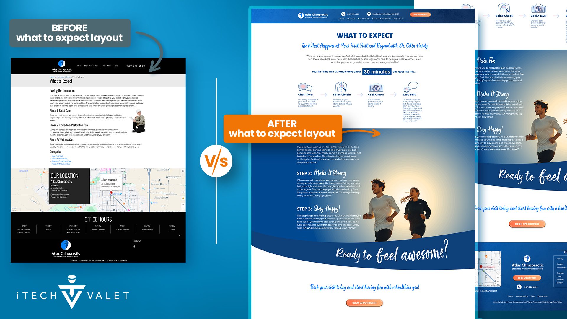

The old "What to Expect" page was confusing. Dense paragraphs. No clear process.
The new design breaks everything down simply. Visual process flow. Easy to understand timeline.
We created a clear 4-step patient journey. Chat Time. Spine Check. Cool X-rays. Easy Talk. Each step removes anxiety about the first visit.
Then we added the 3-phase treatment approach. Pain Fix. Make It Strong. Stay Happy. Simple language patients actually understand.
The new layout guides prospects through exactly what happens. No surprises. No fear. Just confidence about booking that first appointment.
Online Forms That Are Easy To Fill Out
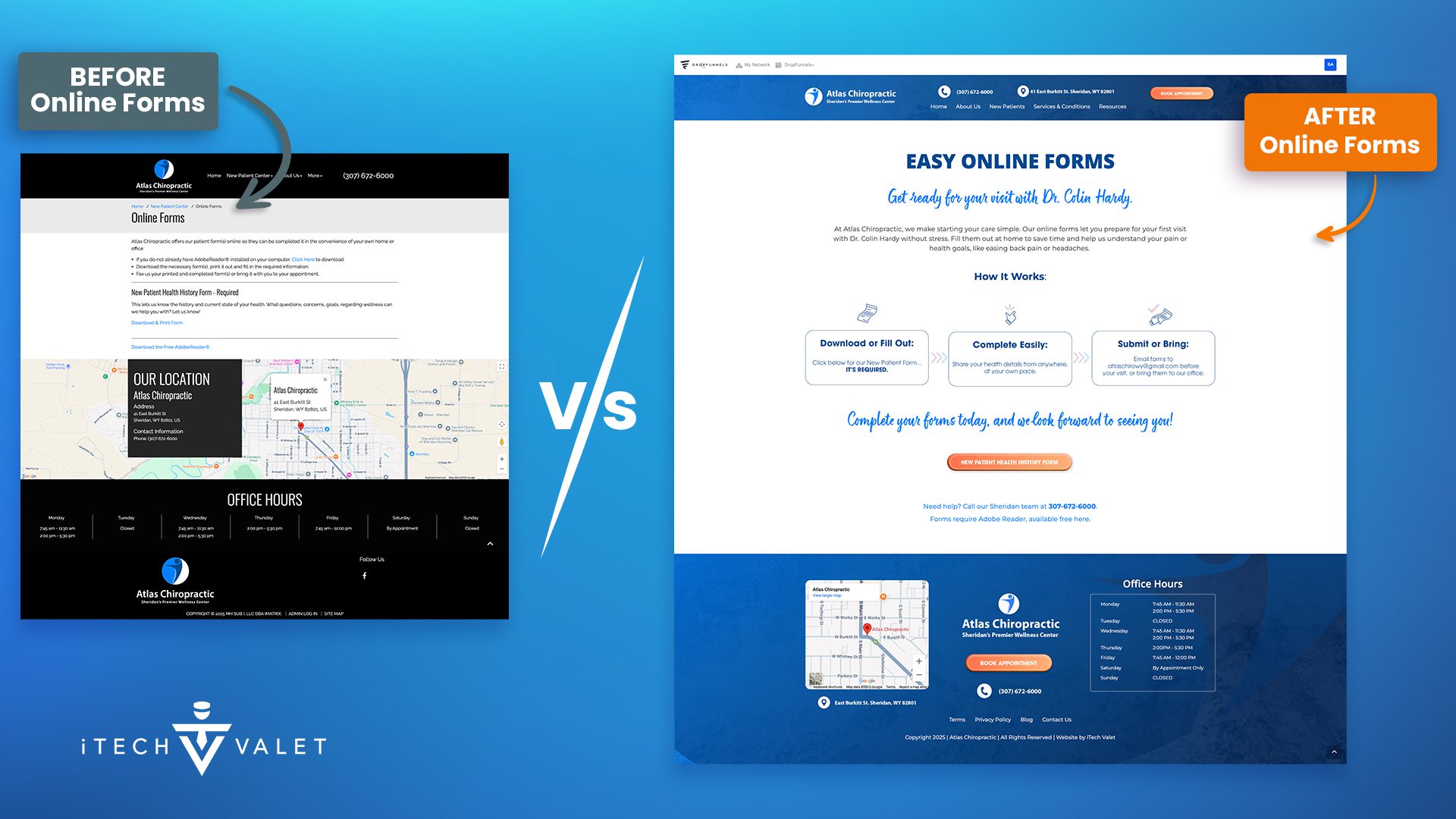

The old forms page was boring and confusing. Dry instructions. No clear benefit. Felt like homework.
The new design makes paperwork feel easy and welcoming. Clear headline. Simple 3-step process. Friendly messaging.
We transformed "Online Forms" into "Easy Online Forms" with a personal touch from Dr. Hardy. The 3-step visual process removes friction. Download or Fill Out. Complete Easily. Submit or Bring.
Smart messaging explains the benefit upfront. "Get ready for your visit" instead of boring form instructions. Even paperwork feels like part of the caring experience.
The new approach turns a necessary evil into a positive first impression. Patients feel prepared and welcomed instead of overwhelmed.
The Secret Weapon: Email List Building
This is where most chiropractic websites fail miserably.
They think in terms of "book now or nothing." That's not how people actually behave.
Most prospects aren't ready to book immediately. They're researching. Comparing options. Building trust.
The old site lost all these people.
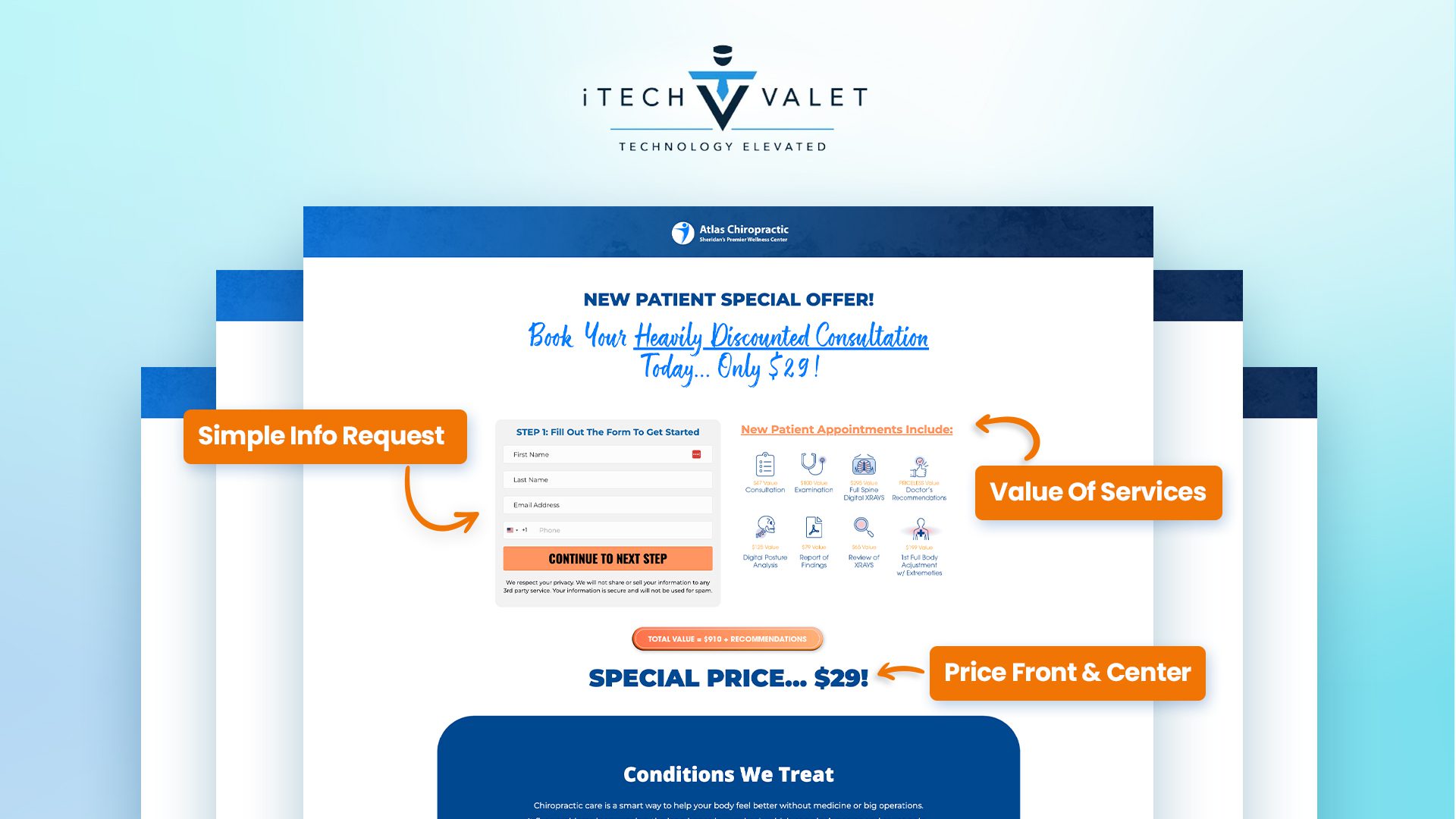

Our new system captures leads at every stage:
New patient specials for people ready to try chiropractic care. Educational resources for people still learning. Treatment guides for specific conditions.
Then we nurture them with email.
The Email Welcome Sequence: Hardy's Health Hits
Here's what happens when someone joins the email list:
Day 1: Welcome message setting expectations for daily value. Day 4: Sciatica relief with simple knee-to-chest stretches. Day 15: Energy boost techniques through spinal care. Day 23: Common chiropractic myths busted with facts. Day 30: Final wellness routine to maintain long-term progress
This sequence builds trust over time. Educates prospects. Positions Atlas as the obvious choice.
When they're finally ready to book, guess who they call?
Why This Works for Chiropractic Practices
Most chiropractors face the same challenges Dr. Hardy had.
Your patients see you as interchangeable. They shop based on location and insurance. Price becomes the only differentiator.
That's a losing game.
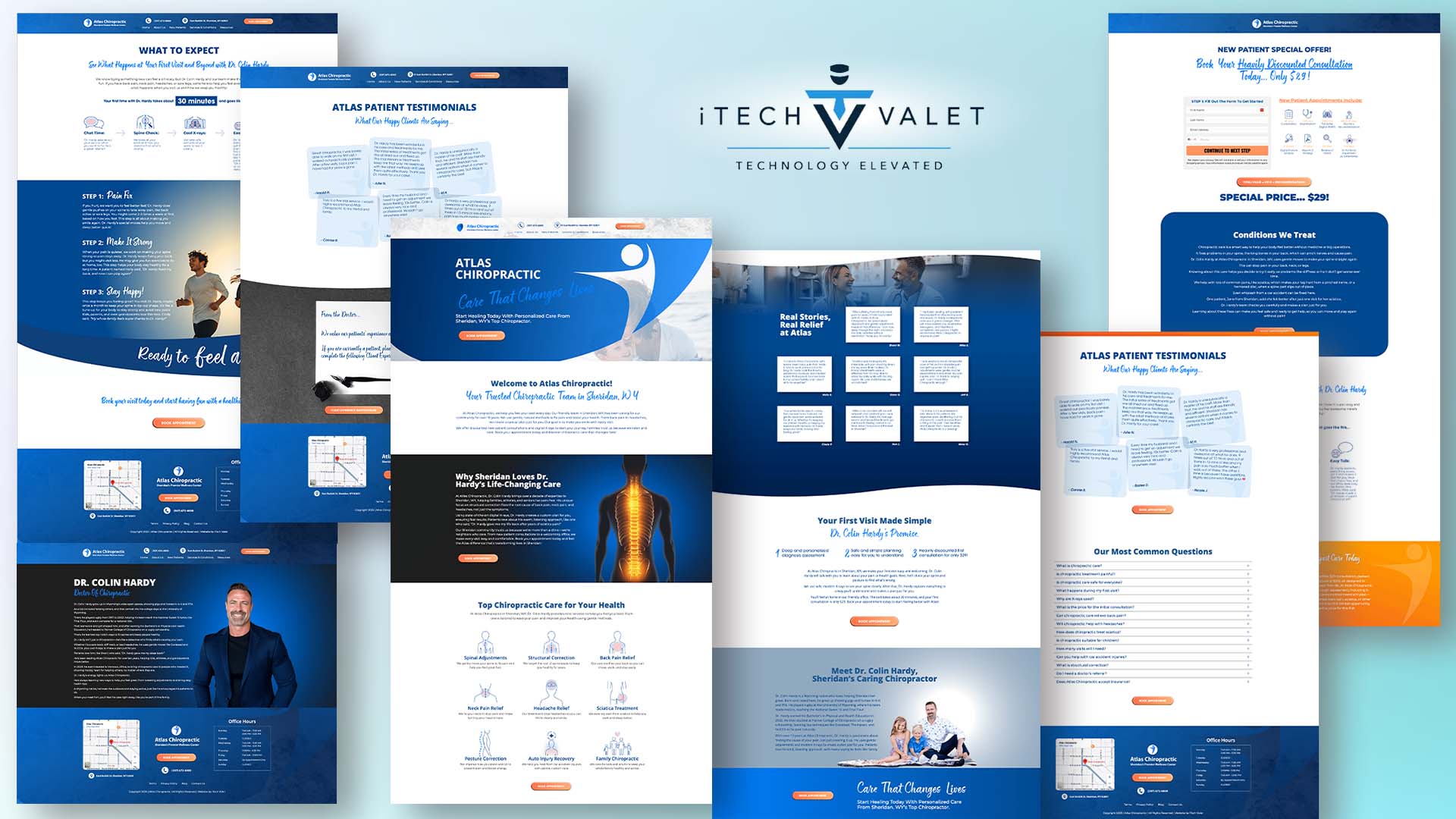

Professional web design changes the conversation. It positions you as premium. Justifies higher fees. Builds trust before the first visit.
People will pay more for quality. But they need to perceive that quality first.
Your website is often their first impression. Make it count.
Ready to See How We Fix Chiropractic Websites?
We've transformed 150+ service-based websites using our proven 4-step system. See exactly how we combine premium design with conversion science.
The Bottom Line Results
We can't share Dr. Hardy's specific numbers (privacy, you know). But similar healthcare redesigns typically see:
Contact form submissions increase by 40-60%. More people reaching out means more appointments.
Appointment booking rates improve by 25-35%. Better user experience removes friction.
Email list growth explodes by 300-500%. Now you can nurture prospects who weren't ready immediately.
Higher quality leads show up. The educational content pre-qualifies people.
Average patient value increases. Premium positioning justifies higher fees.

Plus all the long-term benefits. Competitive advantage. Better patient education. More referrals.
Patients are actually proud to share a professional-looking website.
What This Means for Your Practice
Your website should work like your best employee. Available 24/7. Always professional. Never takes a sick day.
It should qualify prospects. Build trust. Guide people toward booking. Capture leads for future nurturing.
Most chiropractic websites do none of this.
They're digital business cards at best. Expensive liabilities at worst.

The Atlas transformation shows what's possible. When you invest in professional design that understands healthcare marketing.
This wasn't about making things "look pretty." It was about creating a revenue-generating business asset.
Ready to Transform Your Practice?
Ask yourself these questions:
Are you losing prospects to competitors with better websites? Do you capture leads before they're ready to buy? Does your site build trust or look like everyone else's?
If you're not happy with your answers, let's talk.
Your practice deserves a website that actually grows your business. Not one that just sits there looking outdated.
The Atlas Chiropractic redesign proves professional web design isn't an expense. It's an investment that pays for itself many times over.
Our Free Website Conversion Analysis gives you a personalized Loom walkthrough of what's actually broken—delivered in 24 hours, zero sales pitch.
We'll cover:
- Why visitors aren't converting
- What's broken on phones
- Trust gaps costing you
- Quick fixes
Get your free analysis here — honest feedback, nothing to buy.
Because hoping your website works isn't a strategy. Knowing what's broken is.


Gerek Allen
Co-Owner iTech Valet
Entrepreneur, patriot, CrossFit junkie, IPA enthusiast, loves to travel to tropical destinations, and knows way too many movie quotes.
About iTech Valet
iTech Valet specializes in web design and content marketing for online entrepreneurs who want to share their expertise.
Services Include:
- Web Design
- Graphic Design
- Sales Copy
- Funnel Building
- Authority Sites
- Membership Sites
- Course Creation
- Email Systems
- Content Marketing
- Competitive Analysis
- Tech Integrations
- Strategic Planning


